 Service Tips & Tricks Websites Joomla Joomla Artisteer problem with Responsive Design column layout
 Joomla Artisteer problem with Responsive Design column layout
Problem:
An Artisteer template does not break correctly in the Responsive Design in Joomla at a category blog. This means that the images are not compressed and wrapped correctly. One column in 3 column mode is even slightly wider than the other two. On some websites you can read that everything is much easier and better with Bootstrap. If you don't want to spend money for e.g. Themler again, there is only the adjustment of the CSS file of the Artisteer template under "Export | Options | CSS Options".
1. Topic "Column width"
Since Artisteer already gives 34% width in the 3-col layout of a column and the other two 33%, that can't work that way. This wrong division can be found in the template.css file. For 2 columns, however, the specifications of 50% fit. The corrected code for 3 column layout to overload is:
/* IWOXX - Correct Artisteer's wrong column settings for 3-col layout */
.cols-3 .column-1
{
width: 33.3333%;
}.cols-3 .column-2
{
width: 33.3333%;
}.cols-3 .column-3
{
width: 33.3333%;
}
Now all 3 columns are exactly the same width!
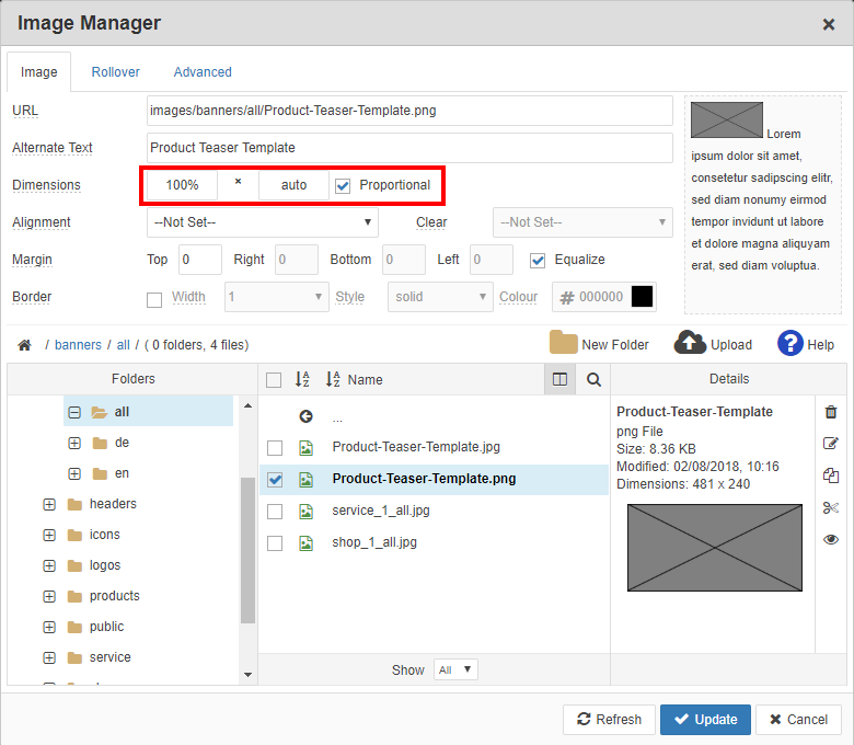
2. Theme "Automatic resizing of images"
Use the editor in the content of the Joomla article to edit the desired image and specify "100%" for the width and "auto" for the height. ATTENTION: Sometimes a value changes to "NaN". Then please correct it again. Don't be frightened: If you change these parameters, the image fills the entire editor. In the category blog view, however, the image for all columns is displayed cleanly and also zoomed, as well as with the text of the post neatly wrapped for smartphones and tablets.
Via editor code mode (HTML code):
<img class="myclass" src="/images/banners/all/Product-Teaser-Template.png" alt="Product Teaser Template" style="margin: 0px;" width="100%" height="auto" />
About the properties of an image in editor mode: